With pressure to justify every square foot of real estate and conserve energy, the larger-than-life front hall is undergoing a metamorphosis. It’s not disappearing, though—rather, it’s doing its job of welcoming in a more compact, efficient way.
Design experts may use different terms to describe the space beyond a front door—vestibule, hallway, entryway, foyer. The terms are quite interchangeable with slight variations. A vestibule is generally a small, separate air-lock that stops cold and hot air from entering the rest of the house. A hallway provides entry but also links spaces and rooms—at the front or anywhere in the home, says design guru Marianne Cusato, author of The Just Right Home (Workman Publishing). Of course there are dozens of other words you can use to describe this space. And whether you pronounce the foyer as foy-yay with a French spin or foy-er (rhymes with lawyer) really depends on how grand you or your home owners want the space to sound.
Whatever you call it, it’s important to understand the potential impact the entrance to a home can have on a visitor’s first impressions, says Stephanie Mallios, e-PRO, salesperson with Towne Realty in Short Hill, N.J. “If there are too many shoes and coats strewn about and no place to put keys or gloves, many buyers will have a tough time imagining how they’ll live there,” she says.
Study these eight design details to help your clients create a welcoming space that does its job well, both aesthetically and functionally—no matter what it’s called.
Size, scale, sequence. Due to energy-efficiency concerns,an entry with a soaring ceiling and sweeping staircase is far less popular than it once was. Still, a modest entryway as small as 4 feet to 5 feet wide can convey a proper sense of arrival, says Cusato. More important than size is the scale (the space should be in proportion with the rest of the house) and the sequence (the rest of the home should flow out in a logical way), says architect Duo Dickinson, author of Staying Put (Taunton Press). Upon entering, people should be able to see other spaces and rooms and know where to go next, says architect Julie Hacker of Cohen-Hacker Architects in Evanston, Ill. In the best layouts, there may even be a view straight through to a backyard.
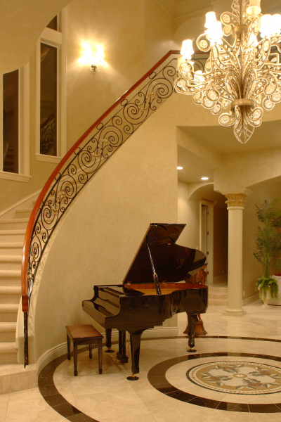
Height. The number of levels or floors in the structure often determines this factor, though even two- and three-story homes are moving away from entries with soaring ceilings. The location of a stairway will hinge in part on square footage and what role an architect or builder wants the stairs to play. In smaller homes, it’s often part of the foyer but off to the side, and goes straight up—being purely functional. In larger homes, the staircase might occupy its own separate hall and curve gracefully to a landing, past a window or window bank, and up to the next level. To carpet or not is a personal preference, though bare treads can be noisy; a good compromise is a runner covering painted or hardwood treads.
Millwork. To fashion a gracious entry, most design pros recommend a door that is at least three feet wide and 72 inches tall. The trend of pricey double doors is disappearing, according to Chicago-area builder Orren Pickell. Whether a door includes a glazed transom or sidelights should depend on how home owners feel about privacy and bringing natural light into the interior. The size of the glazing should be proportional to the door’s width and height. For baseboard and crown molding, simplification is the overriding trend, which keeps fussiness and costs down, except for the most traditional houses, says Cusato. Wainscoting is another way to add visual detail. Columns are helpful to screen off adjoining rooms without completely walling them off. Hacker uses two columns with space for books cut out on the back side of each on the living room side to separate areas in her home.

Lighting. Good lighting is essential for safety, but it also sets a welcoming mood. A chandelier or large pendant is the obvious choice, while ceiling cans or sconces also work well. Whatever fixture home owners prefer, advise them to install dimmers. Not only will this allow them to save energy, but options for differing lighting intensity and color can also help set a dramatic mood for a party, a bright feel for an open house, and a low-light one for romance.
Flooring. A visually rich, substantial looking floor will reward visitors, says Dickinson. But due to the wear and tear common for front entryways, it should also be practical. Slate, stone, and porcelain meet that criteria, though they can be cold on bare feet in winter. Avoid soft woods that may dent and scratch; don’t use carpeting since it will become too dirty with traffic; and avoid vinyl unless it’s one of the more expensive, newer-looking versions. Home owners may wish to set off the area in a different material than adjacent rooms and hallways. But choosing one common material for several rooms produces a feeling of continuous flow and makes smaller rooms appear larger.
Furnishings. Depending on the entry’s size, home owners might consider adding a table to place mail, gloves, hats, and keys. Also, a mat or rug to wipe off feet and a chair or bench to put on and take off footwear can be helpful for maintaining tidiness. Finally, a mirror to check one’s appearance before heading out the door—or joining a group when entering—can be a welcome sight.

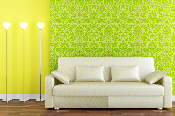
Wallpaper vs. paint. This choice is highly personal. If home owners love color, they should go for the paintbrush, with the knowledge that darker palettes can add drama and romance. Of course, not all future buyers will have the same taste, but repainting is an easy home repair in smaller areas. If your clients are into patterns, the same rule applies, though today many wallpapers are quite easy to hang and remove. The key is for surfaces to appear clean and not look dated, which may mean banishing that old-school floral style.
Bells and whistles. A coat closet is a nice extra, as is a powder room, though newer construction may feature such conveniences at the back of a domicile where they’ll be used most frequently. An umbrella stand can hold a variety of other items—canes, tennis racquets—neatly, and niches or shelves can display collectibles. A doorknocker outside, even if rarely used, is a classy touch akin to wearing one great piece of statement jewelry. It can really give the front door a Downton Abbey feel.
If your buyers and sellers take away just one lesson from you, it should be that a well-planned front entrance—no matter the name, size, or style—will add value to their home.
Credit to Barbara Ballinger
Barbara Ballinger is a freelance writer and the author of several books on real estate, architecture, and remodeling, including The Kitchen Bible: Designing the Perfect Culinary Space (Images Publishing, 2014). Barbara’s most recent book is The Garden Bible: Designing Your Perfect Outdoor Space, co-authored with Michael Glassman (Images, 2015).
