Tag Archives: home design

2017 Home Design Trends

Housing styles emerge slowly and typically appeal first to cutting-edge architects, builders, and interior designers. As a trend spreads and gains wider interest, it may go mainstream, become almost ubiquitous, and eventually lose its star power. Just look at once-favored granite, which now has been replaced by the equally durable and attractive options of quartz and quartzite.

The economy, environment, and demographics always play a big role in trend spotting. But this year there are two additional triggers: a desire for greater healthfulness and a yearning for a sense of community.

1. Community Gathering Spaces

Why it’s happening: The combination of more time spent on social media and at work and the fact that fewer people live near their family members has caused many to feel isolated and crave face-to-face interactions.

How it will impact you as a real estate pro: Multifamily buildings and even single-family residential developments are rushing to offer an array of amenity spaces to serve this need. Some popular options include clubhouses with spiffy kitchens, outdoor decks with pools and movie screens, fitness centers with group classes, and drive-up areas for food-truck socials. At its Main+Stone building in Greenville, S.C., The Beach Co. began hosting free monthly events such as its “Bingo & Brews.” Make sure you know which buildings, communities, and neighborhoods offer these sought-after social events and gathering spaces so you can help clients connect.

2. Taupe Is the New Gray

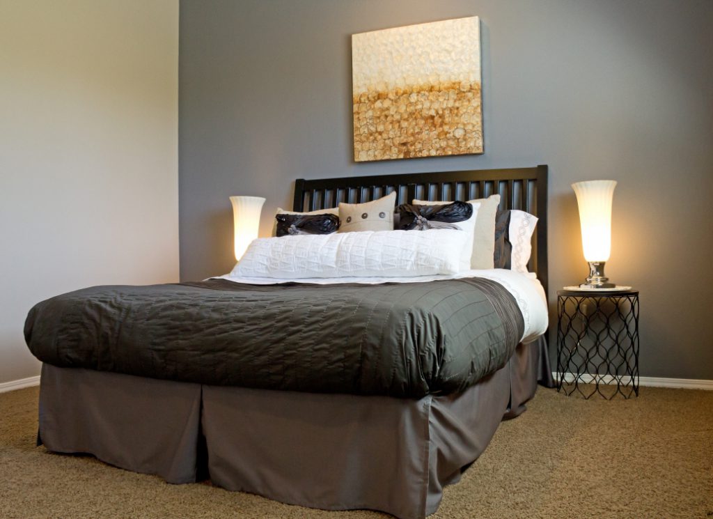
Why it’s happening: White remains the top paint color choice due to its flexibility and the fact that it comes in so many variations (PPG Paints has 80 in its inventory, according to Dee Schlotter, senior color expert). Though white has been upstaged by gray in recent years, this year many will be searching for a warmer neutral, which is why paint manufacturer Sherwin-Williams named “Poised Taupe” as its 2017 Color of the Year. “Poised Taupe celebrates everything people love about cool gray as a neutral, and also brings in the warmth of a weathered, woodsy neutral and a sense of coziness and harmony that people seek,” says Sue Wadden, the company’s director of color marketing.

How it will impact you: Dallas-based designer Barbara Gilbert considers taupe a smart alternative since it still performs as a neutral with other colors, cool or warm. She expects to see taupe on more exteriors — blending well with roofs, doors, window frames, and surrounding landscape — but it also will turn up indoors on walls, ceilings, kitchen cabinets, furnishings, and molding. It might even work to help update a listing clad in gray, she says, as the two colors work well together.

3. More Playful Homes

Why it’s happening: Americans work harder now than ever, with many delaying retirement or starting second careers, so they want their homes to be a refuge and a place to unwind.

How it will impact you: Be sure you’re asking buyers how they like to spend their free time. Spaces that encourage play are trending higher on their wish lists, whether it’s a backyard bocce court (the latest outdoor amenity to show up in residential backyards) or a putting green. And sports don’t have to be relegated to the outdoors. says Gilbert; technological advances have allowed for rapid improvement in indoor golf simulators, for example. While some of her clients have installed modest models, she’s working on a dedicated golf room with software that gives homeowners virtual access to any golf course in the world. Though landscape architect Steve Chepurny of Beechwood Landscape Architecture in Southampton, N.J., designs putting greens with synthetic grass that range from $12,000 to $30,000, he also notes he’s seeing more playfulness outdoors in the form of non-sports amenities, such as pizza ovens.

4. Naturally Renewable, Warmer Surfaces

Why it’s happening: The pervasiveness of technology throughout homes has resulted in a corresponding yearning for more tactile surfaces and materials that convey warmth. Natural cork is a perfect expression of these needs, with the bonus of being low-maintenance.

How it will impact you: In recent years, cork, a renewable material harvested from the bark of cork oak trees, has resurfaced as a favorite for myriad uses, and for good reason. Some credit designer Ilse Crawford’s introduction of cool, edgy cork pieces in her “Sinnerlig” collection for IKEA for the resurgence. Aside from aesthetics, the material is appealing since it’s resistant to mold, mildew, water, termites, fire, cracking, and abrasions. Moreover, cork can be stained and finished with acrylic- or water-based polyurethane. Chicago designer Jessica Lagrange likes to incorporate cork to clad walls and floors. “It’s an especially effective and forgiving choice since dents bounce back and floors retain heat,” she says.

5. Surface-Deep Energy Conservation

Why it’s happening: As energy costs continue to increase, the search is on for ways to save. Incentives to do so only increase as states and municipalities enact new, stricter energy codes. While energy-wise appliances and more efficient HVAC systems are still appealing to homeowners looking to save on their utility bills, less costly surface upgrades are gaining in popularity.

How it will impact you: After New Jersey increased its requirements for insulation, architect Jason Kliwinski, principal at Designs for Life and current chair of New Jersey’s AIA Committee on the Environment, went looking for new options. He found new low-E window film that can double the performance of glass at one-fifth the cost of a full window replacement. Several options for this film are on the market now, and Kliwinski says manufacturers such as EnerLogic are producing versions that are invisible when installed. Other surface-change artists that lower energy use and that are cost-effective and relatively easy to apply include a ceramic insulating paint coating for walls and a thermal energy shield for attic interiors. Tesla, the innovative manufacturer of electric cars, is just debuting solar glass tiles that resemble traditional roof materials such as slate and terracotta, but provide passive heat gain.

6. More Authentic, Personalized Use of Space

Why it’s happening: As home prices escalate — up 5.5 percent, according to CoreLogic Case-Shiller — and baby boomers downsize to retire or cut costs, every inch of available space counts more than ever. To make the best use of space for each resident, design professionals are zeroing in on how clients want to live rather than thinking about how people use space generically. “One size doesn’t fit all any longer,” says Mary Cook, whose eponymous Chicago-based design firm specializes in amenities, public spaces, and model home interiors.

How it will impact you: You and your clients are likely to see a greater variety in terms of layouts, building materials, home systems, color palettes, and furnishing choices, both in model homes and in houses staged for sale. Listing agents can take the cue from this trend by helping sellers highlight the flexibility of their spaces when putting a home on the market. Buyers’ reps should similarly showcase a range of living options in each home-shopping session.

7. The Walkable Suburb

Why it’s happening: Urban centers have long been a magnet for residents wanting to walk rather than drive to work, shopping, and entertainment. But the trend is now spreading to the suburbs where being close to a town center — and public transit into a larger city — offers similar appeal.

How it will impact you: A high walk score has become a recognized real estate marketing tool. Real estate salesperson Stephanie Mallios of Coldwell Banker Residential Brokerage in Short Hills, N.J., has seen a huge uptick in interest and value in single-family homes and townhouses close to town centers, especially those near a train station if residents commute to a large metropolitan area. “Most homes for sale in my area list the number of blocks and steps to public transit in their marketing materials. Homes far from everything have become less valuable,” Mallios says. The most appealing towns also incorporate individually owned shops rather than chain stores.

8. Healthier Homes

Why it’s happening: Consumers have been increasingly aware of hazardous indoor environments over the last few years, but news of the lead-tainted water crisis in Flint, Mich., raised awareness to a nationwide level in 2016. Homeowners are actively seeking out healthy water supplies, purifiers, and HVAC systems, along with nontoxic paints and adhesives. A newer element to this trend in 2017 will include enhanced environmental testing.

How it will impact you: A growing number of builders, remodelers, architects, and interior designers expect health to influence their business decisions due to consumer demand, according to studies from both the Urban Land Institute and McGraw-Hill Construction. You should expect to see more buyers hiring health experts to examine listings and requiring in-home contaminant removal prior to a sale. Your clients will also have greater access to additional home products that promote healthy sleep patterns, such as those featuring UV and LED circadian lighting.

9. Shifting Hearths

Why it’s happening: The traditional log-burning fireplace has lost some appeal as homeowners realize it’s less energy-efficient and can send more particulates into the air. But there are a number of replacement options waiting in the wings.

How it will impact you: Homeowners have been switching out their log-burning fireplaces with new gas models for many years. Newer on the market are the ventless alcohol-burning fireplaces that can be placed almost anywhere and without costly construction, says Los Angeles–based designer Sarah Barnard. Another increasingly popular solution is to build a fireplace outdoors, according to landscape architect Chepurny.

10. Counter Options

Why it’s happening: Much like granite did, quartz and quartzite are predicted to be kitchen favorites until another material comes along. But other green laminate options are gaining in popularity, and they’re no longer just for the budget-minded consumer.

How it will impact you: A new countertop can make a big difference in the appeal of a room. Sally Chavez, senior product designer at Wilsonart in Temple, Texas, which manufactures engineered surfaces, says laminate options that mimic stone, wood, distressed metal, and concrete are gaining in popularity. But she recommends avoiding designs that include the “spots and dots” or speckled patterns from decades past. Some newer countertop options offer an additional perk: They lessen the time and cost of installation and also eliminate the need to discard the old countertop. Trend Transformations, an Italian manufacturer with a U.S. manufacturing facility, incorporates recycled granite, glass, and even seashells in its surfaces, which are installed over an existing countertop. Installation can be finished within a day, and prices are competitive with quartz and quartzite. Because these countertops are less porous than traditional stone, they’re also more resistant to stains and scratches.

11. The Transforming Office

Why it’s happening: Regular work-from-home time among the non–self-employed population has grown by 103 percent since 2005, according to Kate Lister, president of Global Workplace Analytics, a San Diego–based research and consulting group focused on workplace change. Her organization estimates that number will continue to grow at between 10 percent and 20 percent a year.

How it will impact you: More of your clients are likely to need a work-from-home space, but due to the diminished size and highly transient nature of technology tools, there’s less need for a dedicated, separate office. Brad Hunter, HomeAdvisor’s chief economist, says almost any area of a house can become a workplace, but the most functional ones incorporate built-ins and furnishings that serve a dual purpose. That same desire for flexibility may someday translate to layouts that can easily change to a homeowner’s whim, such as the KB Home ProjeKt movable wall concept in its “Home of 2050” at the Greenbuild Conference and Expo this past October


Credit to Barbara Ballinger

Barbara Ballinger is a freelance writer and the author of several books on real estate

homes for rent, homes for sale,
homes for rent, homes for sale, newstarrealty.com
Please follow and like us:
error

Style a Master Bedroom as a Sleep Retreat

There’s big buzz these days about the importance of getting enough Z’s for health, happiness, and productivity. Help clients analyze if a master bedroom can incorporate all the essentials to promote a good night’s sleep.

Resized_bedroom_MJCDKIYd


Adults spend more time in their bedroom than in any other room in their house. But you wouldn’t know it from the home sales process. Buyers and sellers alike often pay more attention to kitchens, master bathrooms, closets, and yards than they do to this vital space where they will usually spend more than a third of their 24 hours each day.

“Who spends that kind of time in the kitchen?” asks sleep expert Nancy H. Rothstein, founder of The Sleep Ambassador in Chicago, a source for education, consulting services, and resources that optimize healthy sleep.

Yet more attention is being paid to the importance of getting adequate sleep, from high-profile advocates like Arianna Huffington, who recently published her book, The Sleep Revolution: Transforming Your Life, One Night at a Time (Harmony, 2016), to medical professionals. “Fewer than six hours [a night] can lead to diseases — a higher rate of diabetes, obesity, cardiovascular problems, and even shorter life spans,” says Dr. Susheel Patil, clinical director of Johns Hopkins Sleep Medicine in Baltimore.

While there’s no magic figure for the amount of sleep one should get, Patil suggests adults try for seven to eight hours on average. Dr. Michael Breus, a board-certified sleep specialist in Los Angeles known as The Sleep Doctor, uses his household as an example of the variation. “I need between 6 1/2 and 7 hours while my wife needs between 8 and 8 1/2,” he says.

Buyers and sellers alike should strive to furnish a master bedroom that contributes to high-quality sleep. Updating or remodeling the room offers another benefit, says certified color consultant Michelle Mohlere, a salesperson with Gibson International in Los Angeles. A nicely designed bedroom is likely to bring in more money at resale than one without these touches, she says.

Rustic Bedroom In Traditional Farmhouse

Sellers looking to better stage this room will also gain from the following six steps:

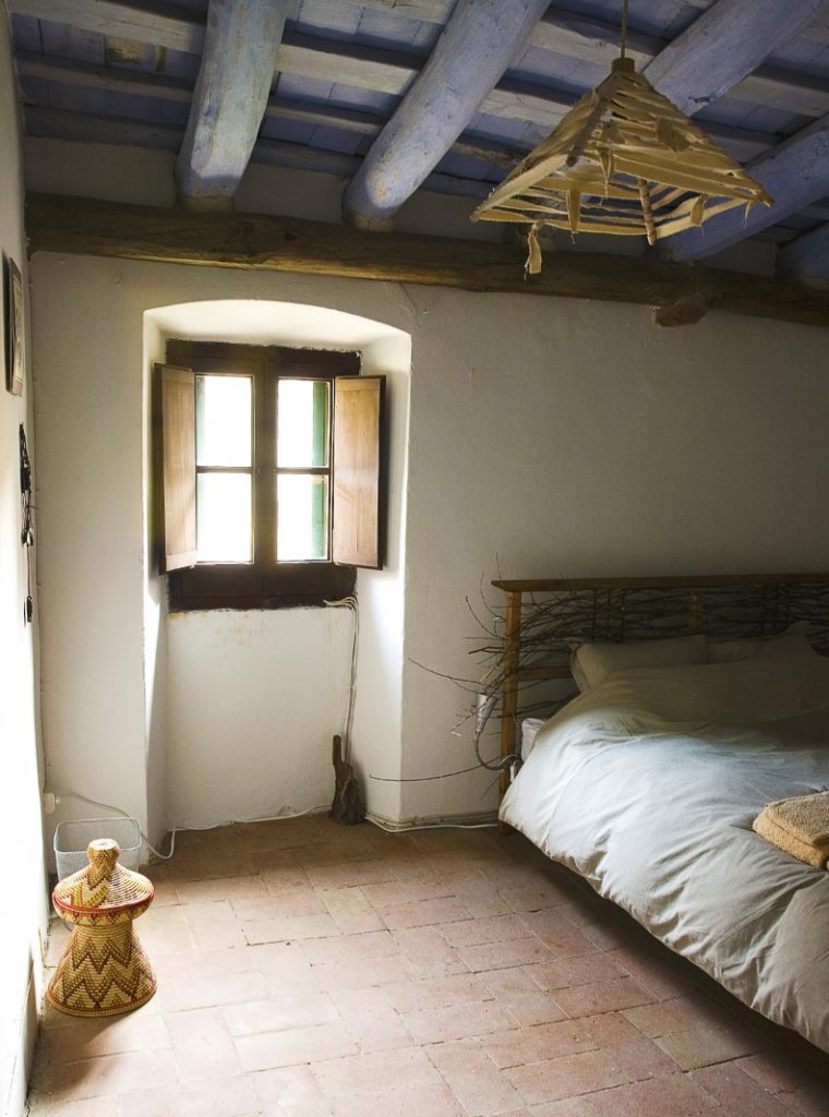
1. Stage the bed in a choice spot. Connecticut architect and author Duo Dickinson prefers the bed be set away from the room’s entrance to keep it out of the main circulation path. Kathryn Baker, vice president of design services with Polaris Pacific, a real estate sales and marketing firm in San Francisco, likes to place a bed in a spot so occupants can enjoy the best view — whether that’s inside (maybe toward a fireplace or favorite piece of art) or outdoor (with views of trees or water where possible). Chicago designer Michael Del Piero suggests pairing a bed with an upholstered headboard for those who like to sit up in bed and read; she dresses up the bed with decorative pillows, a duvet, and a throw to personalize it and make it more welcoming to tuck in for sleep.
2. Install the right window treatments. Minimal is the design mantra when it comes to much of the standard room décor today. But while no coverings in some rooms, such as kitchens and living rooms, allows in more light and views, some amount of treatment in a bedroom is needed to block outside light and provide privacy. Del Piero likes to use a blackout shade behind a transparent shade or drapes or a woven wood shade with blackout drapes. Baker favors motorized shades to make opening and closing a task that can be performed from the bed or set by a timer.

3. Use the right lighting. Dickinson discourages installing recessed cans since they chop up a ceiling and aren’t attractive to look at while in bed. He prefers task lighting from lamps on night tables or wall-mounted sconces. Michigan designer Francesca Owings likes hanging one decorative fixture in a ceiling’s center for an aesthetic punch. Sensitive sleepers might appreciate the new Good Night Biological LED bulbs that claim to help regulate a body’s natural circadian rhythm through the production of the hormone melatonin, which helps control sleep and wake patterns, says Breus.

4. Conceal or banish electronics. For years, scientists and health professionals have known about the danger of the blue light that comes from certain electronics equipment and adversely affects melatonin production, says Patil. But only recently have they suggested that you can enhance unwinding and falling asleep by turning off TVs, smartphones, and iPads at least an hour before bedtime. Shutting them off also helps train the brain that the bedroom is primarily a place to sleep rather than stay awake, Patil says. If the temptation is too great, home owners might consider making the master bedroom a no-electronics zone. Baker’s company furnishes model bedrooms in its residential projects without TVs and other electronics technology to demonstrate this idea. “People have responded favorably, and some put TVs in a second bedroom or home office” instead, she says.

5. Pick a soothing palette. Of course, color is a personal preference, but color experts can offer guidelines. “You can’t say one is soothing for all and will make a person feel calm,” says Jessica Boyer, a Chicago designer with Susan Fredman Design Group. Sue Wadden, director of color marketing for paint manufacturer Sherwin-Williams, says colors that aren’t extreme are more restful. “They’re neither too bold, dark, bright, or intense. Rather, soft and calming,” she says. Designer Kimba Hills of Rumba Style in Los Angeles prefers a palette of pale blues, greens, beiges, grays, and whites for the bedroom. Boyer also likes to bring in bedding in white and light creams because she finds they’re calming. “It’s the equivalent of sleeping in a cloud with nothing to distract me. What’s important isn’t what’s trendy but nurturing,” she says.

6. Add creature comforts. If the room’s size allows, consider adding a chaise, chair and ottoman, and night tables. Also, a large area rug or wall-to-wall carpeting can help deaden noise and provide warmth underfoot, says Owings. If the room is located so it opens directly to the outdoors, play this up. Mohlere says real access to bucolic scenery can contribute to a sense of tranquility even more than just viewing the outdoors can. If outdoor access isn’t possible, check to see that windows are operable for fresh air. Other amenities worth considering: a gas- or log-burning fireplace for coziness, artwork for eye candy, and good storage for tidiness. “Too much clutter is distracting,” Rothstein says.

At the end of the day — or the beginning of a new one — real estate pros can emphasize the master bedroom as one more “fabulous room where you spend time in your new home,” Rothstein says.

Credit to Barbara Ballinger

Barbara Ballinger is a freelance writer and the author of several books on real estate, architecture, and remodeling

Please follow and like us:
error

4 Easy-Living, Universal Design Tips for Any Home

design

One of the basic principles of universal design, also called ageless design, is that it makes homes more practical and safer for everyone — not just the elderly or people with limited mobility.

These days, universal design features are an everyday fact of life for many households, with architects and other professional designers adding universal design ideas as a matter of course.

You don’t have to be a pro designer to incorporate this smart thinking into your own home. If you’re remodeling or simply adding a few upgrades, be sure to keep universal design features in mind. There are lots of resources that’ll give you some great starting points.

As we remodel our 1972 ranch-style house (we’re on the multi-year, budget-as-you-go plan), my wife and I have incorporated several low-cost, easy-to-do UD features. A few of our favorites:

1. Switch out doorknobs for lever-style handles. Doorknobs require lots of dexterity and torque to open; with levers you simply press and go.

Makes sense for folks with arthritis, of course, but think about an emergency situation when everyone, including small kids, needs to exit fast: A lever handle is a safe, foolproof way to open a door.

A big plus: Levers are good-looking and can contribute to the value of your home. A standard interior passage door lever in a satin nickel finish costs $12 to $25; you’ll pay $25 to $50 for a lockable lever set for your bath or bedroom. Replacing door hardware is an easy DIY job.

2. Replace toggle light switches with rocker-style switches. Rocker switches feature a big on/off plate that you can operate with a finger, a knuckle, or even your elbow when you’re laden with bags of groceries.

Rocker switches are sleek and good-looking, too. Ever notice how conventional toggle switches get dirt and grime embedded in them after a couple of years? No more! You’ll pay $3 for a single-pole rocker switch, up to $25 for a set of three-way switches.

3. Anti-scald devices for your bathroom prevent water from reaching unsafe temps. An anti-scald shower head ($15 to $50) reduces water flow to a trickle if the water gets too hot. An anti-scald faucet device ($30 to $50) replaces your faucet aerator and also reduces hot water flow.

Anti-scald valves — also known as pressure-balancing valves — prevent changes in water pressure from creating sudden bursts of hot or cold water. An anti-scald valve ($80 to $170) installs on plumbing pipes inside your walls. If you don’t have DIY skills, you’ll pay a plumber $100 to $200 for installation.

4. Motion sensor light controls add light when you need it. They come in a variety of styles and simple technologies. I like the plug-in sensors ($10 to $15). You simply stick them into existing receptacles, then plug your table or floor lamps into them. When the sensor detects motion, it turns on the light.

They’re great for 2 a.m. snacking, or if your young kids are at that age when they migrate into your bed in the middle of the night. The lights turn off after about 10 minutes if no more motion is detected.


Credit to John Riha

John Riha has written seven books on home improvement and hundreds of articles on home-related topics. He’s been a residential builder, the editorial director of the Black & Decker Home Improvement Library, and the executive editor of Better Homes and Gardens magazine.


NS_Blog_Web_Banner

Please follow and like us:
error

Front Entry Tips and Trends for Every Home

homede1

With pressure to justify every square foot of real estate and conserve energy, the larger-than-life front hall is undergoing a metamorphosis. It’s not disappearing, though—rather, it’s doing its job of welcoming in a more compact, efficient way.

Design experts may use different terms to describe the space beyond a front door—vestibule, hallway, entryway, foyer. The terms are quite interchangeable with slight variations. A vestibule is generally a small, separate air-lock that stops cold and hot air from entering the rest of the house. A hallway provides entry but also links spaces and rooms—at the front or anywhere in the home, says design guru Marianne Cusato, author of The Just Right Home (Workman Publishing). Of course there are dozens of other words you can use to describe this space. And whether you pronounce the foyer as foy-yay with a French spin or foy-er (rhymes with lawyer) really depends on how grand you or your home owners want the space to sound.

Whatever you call it, it’s important to understand the potential impact the entrance to a home can have on a visitor’s first impressions, says Stephanie Mallios, e-PRO, salesperson with Towne Realty in Short Hill, N.J. “If there are too many shoes and coats strewn about and no place to put keys or gloves, many buyers will have a tough time imagining how they’ll live there,” she says.

Study these eight design details to help your clients create a welcoming space that does its job well, both aesthetically and functionally—no matter what it’s called.

Size, scale, sequence. Due to energy-efficiency concerns,an entry with a soaring ceiling and sweeping staircase is far less popular than it once was. Still, a modest entryway as small as 4 feet to 5 feet wide can convey a proper sense of arrival, says Cusato. More important than size is the scale (the space should be in proportion with the rest of the house) and the sequence (the rest of the home should flow out in a logical way), says architect Duo Dickinson, author of Staying Put (Taunton Press). Upon entering, people should be able to see other spaces and rooms and know where to go next, says architect Julie Hacker of Cohen-Hacker Architects in Evanston, Ill. In the best layouts, there may even be a view straight through to a backyard.

Height. The number of levels or floors in the structure often determines this factor, though even two- and three-story homes are moving away from entries with soaring ceilings. The location of a stairway will hinge in part on square footage and what role an architect or builder wants the stairs to play. In smaller homes, it’s often part of the foyer but off to the side, and goes straight up—being purely functional. In larger homes, the staircase might occupy its own separate hall and curve gracefully to a landing, past a window or window bank, and up to the next level. To carpet or not is a personal preference, though bare treads can be noisy; a good compromise is a runner covering painted or hardwood treads.

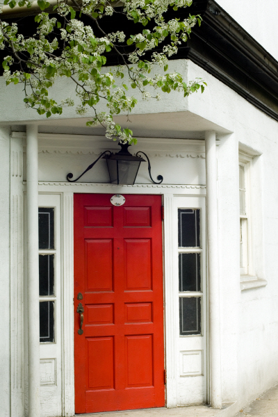
Millwork. To fashion a gracious entry, most design pros recommend a door that is at least three feet wide and 72 inches tall. The trend of pricey double doors is disappearing, according to Chicago-area builder Orren Pickell. Whether a door includes a glazed transom or sidelights should depend on how home owners feel about privacy and bringing natural light into the interior. The size of the glazing should be proportional to the door’s width and height. For baseboard and crown molding, simplification is the overriding trend, which keeps fussiness and costs down, except for the most traditional houses, says Cusato. Wainscoting is another way to add visual detail. Columns are helpful to screen off adjoining rooms without completely walling them off. Hacker uses two columns with space for books cut out on the back side of each on the living room side to separate areas in her home.

light1

Lighting. Good lighting is essential for safety, but it also sets a welcoming mood. A chandelier or large pendant is the obvious choice, while ceiling cans or sconces also work well. Whatever fixture home owners prefer, advise them to install dimmers. Not only will this allow them to save energy, but options for differing lighting intensity and color can also help set a dramatic mood for a party, a bright feel for an open house, and a low-light one for romance.

Flooring. A visually rich, substantial looking floor will reward visitors, says Dickinson. But due to the wear and tear common for front entryways, it should also be practical. Slate, stone, and porcelain meet that criteria, though they can be cold on bare feet in winter. Avoid soft woods that may dent and scratch; don’t use carpeting since it will become too dirty with traffic; and avoid vinyl unless it’s one of the more expensive, newer-looking versions. Home owners may wish to set off the area in a different material than adjacent rooms and hallways. But choosing one common material for several rooms produces a feeling of continuous flow and makes smaller rooms appear larger.

Furnishings. Depending on the entry’s size, home owners might consider adding a table to place mail, gloves, hats, and keys. Also, a mat or rug to wipe off feet and a chair or bench to put on and take off footwear can be helpful for maintaining tidiness. Finally, a mirror to check one’s appearance before heading out the door—or joining a group when entering—can be a welcome sight.

wqll1

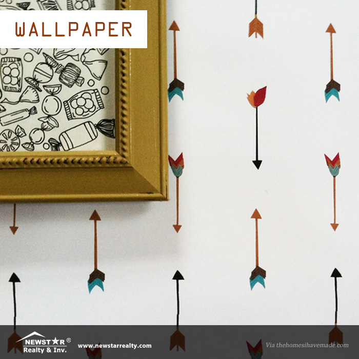
Wallpaper vs. paint. This choice is highly personal. If home owners love color, they should go for the paintbrush, with the knowledge that darker palettes can add drama and romance. Of course, not all future buyers will have the same taste, but repainting is an easy home repair in smaller areas. If your clients are into patterns, the same rule applies, though today many wallpapers are quite easy to hang and remove. The key is for surfaces to appear clean and not look dated, which may mean banishing that old-school floral style.

Bells and whistles. A coat closet is a nice extra, as is a powder room, though newer construction may feature such conveniences at the back of a domicile where they’ll be used most frequently. An umbrella stand can hold a variety of other items—canes, tennis racquets—neatly, and niches or shelves can display collectibles. A doorknocker outside, even if rarely used, is a classy touch akin to wearing one great piece of statement jewelry. It can really give the front door a Downton Abbey feel.

If your buyers and sellers take away just one lesson from you, it should be that a well-planned front entrance—no matter the name, size, or style—will add value to their home.


Credit to Barbara Ballinger

Barbara Ballinger is a freelance writer and the author of several books on real estate, architecture, and remodeling, including The Kitchen Bible: Designing the Perfect Culinary Space (Images Publishing, 2014). Barbara’s most recent book is The Garden Bible: Designing Your Perfect Outdoor Space, co-authored with Michael Glassman (Images, 2015).

Please follow and like us:
error